How Visualizations Reveal Centuries of Change in Birthplace, Occupation, and Gender of Famous Figures
A Tableau dashboard created to showcase the changes in birthplaces, occupations, and gender of notable individuals from 3600 BC to 2100 AD.
By Emma Horton.
Introduction
Have you ever wondered how the birthplaces, occupations, and gender ratios of notable individuals have evolved over time? From ancient philosophers to modern innovators, the lives of renowned people span across geography, industries, and centuries. In this post, I’ll explore how visualizing these historical trends can unlock fascinating insights about the shifting landscape of fame. Through interactive visualizations, we can observe trends in the birthplaces, occupations, and gender of notable individuals across different centuries and domains. Let’s dive into the techniques and findings from this data-driven project.
Pantheon: A Dataset of Globally Famous Biographies
At the heart of this analysis is the Pantheon dataset, an impressive collection of famous individuals compiled by Yu et al [1]. This dataset, meticulously curated and verified, includes 11,341 biographies of notable figures whose influence spans across both geography and time. What makes Pantheon particularly fascinating is its scope: every person included has a biography available in over 25 languages on Wikipedia as of May 2013, ensuring a truly global perspective on fame.
The Power of Data Visualizations
Why use visualizations? Complex datasets, especially those covering vast timelines and geographical regions, can be hard to interpret when only presented as raw numbers. Visual representations, on the other hand, make it easier to see patterns and detect shifts that may not be obvious in the data alone. In this project, I mapped the birthplaces, occupations, and gender ratios of notable individuals over centuries. By using different visual encoding techniques, I enabled viewers to uncover the evolution of societal prominence and influence.
What is Visual Encoding and Why Does It Matter?
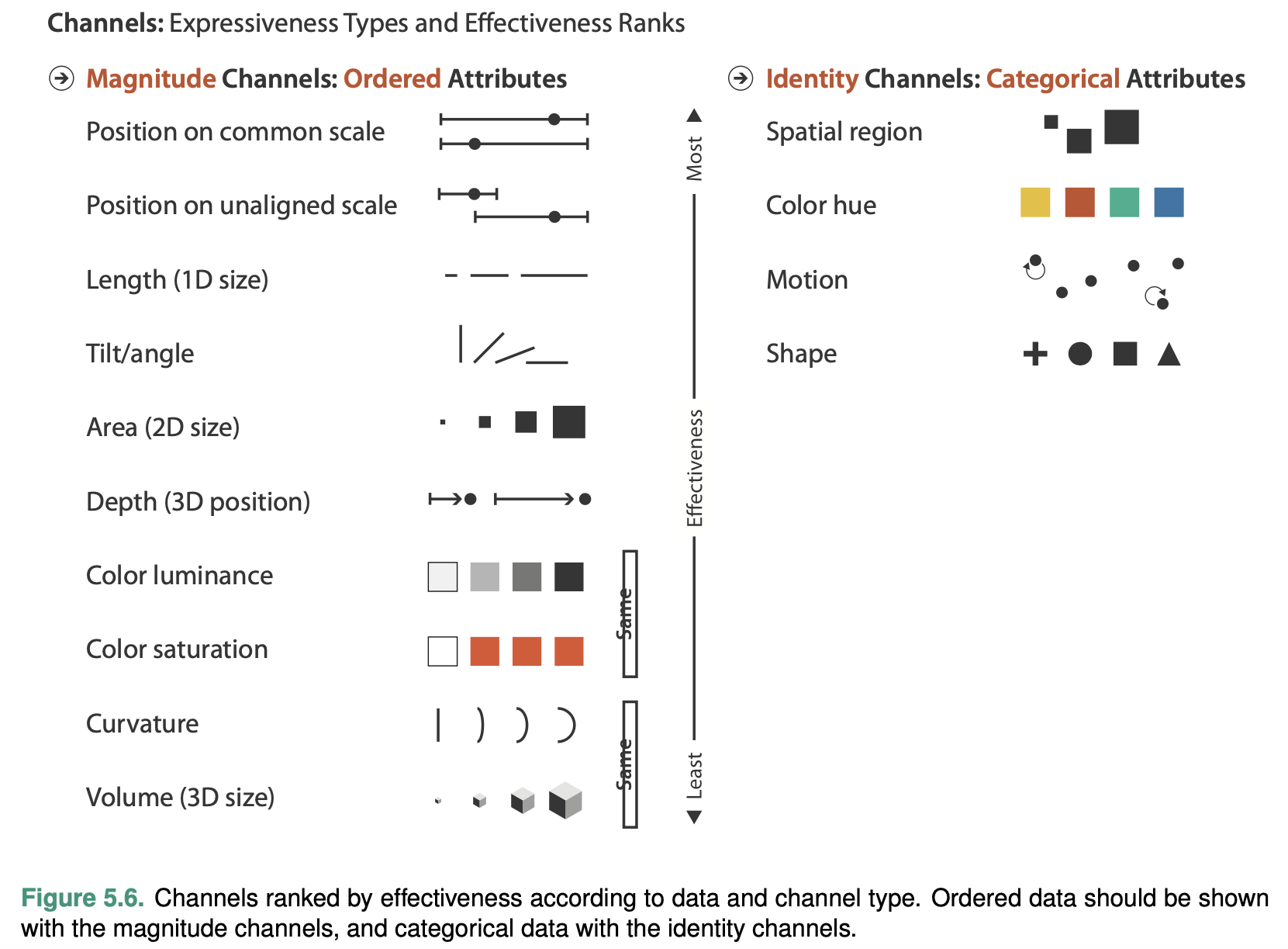
When designing data visualizations, how you present the information can make or break the viewer’s ability to understand it. This is where visual encoding comes into play. Simply put, visual encoding is the process of transforming data into visual elements like color, size, position, and shape. These elements are used to represent different attributes of the dataset in a way that viewers can quickly grasp.
But it’s not just about making the data look pretty—it’s about making it expressive and effective. A visualization is expressive if it expresses all of, and only, the information in the dataset attributes. It’s effective if it allows users to interpret the data easily, highlighting important trends, comparisons, and distinctions.
For example, encoding quantitative data using position on a graph is effective because our eyes are naturally good at comparing positions. On the other hand, using color to represent similar data might be less effective, since we can only distinguish between a limited number of hues with precision.
By carefully choosing how data is visually encoded, we can create visualizations that not only look good but also communicate complex information clearly and intuitively. This balance between expressiveness and effectiveness is the key to creating powerful and insightful visualizations that help people truly understand the story behind the data.

Justifying the Visual Encoding Techniques Used
To ensure the data was presented clearly and meaningfully, I employed a range of visual encoding techniques, each chosen for its ability to balance expressiveness and effectiveness.
Birthplace Mapping
Country: The position on a common scale was used to represent countries. This was an expressive choice because it naturally revealed the geographic ordering of countries, making it easy for viewers to intuitively grasp relationships between them. It was also effective, allowing users to make clear distinctions between countries, which was crucial given the large number of countries in the dataset. Additionally, this method helped users draw associations between countries located in similar geographic regions.
Count of Names: For the count of names, I encoded the data using size (area). This approach was expressive, as it visually suggested a ranking among the countries based on the number of names associated with them. However, its effectiveness was somewhat limited due to the inherent difficulty of accurately perceiving area sizes, which made it harder for users to determine exact numerical values. Despite this limitation, size was chosen over alternatives such as color (value), as it offers better perceptual accuracy according to Stevens' psychophysical power law. Although not perfect, it provided a more intuitive ranking system than the alternative.
Birth Year
Birth Year: The position on a common scale was used to encode birth years. This was an expressive choice as it clearly revealed the intrinsic ordering of years along a timeline. It was effective because it allowed users to easily distinguish between different years, which was important given the large number of years featured in the dataset. Additionally, it enabled users to make associations between years that fell within similar timeframes.
Comprehensive Notability Score (CNS): CNS was encoded using size (height). This was an expressive method because it visually suggested a ranking, with taller areas assigned to individuals with higher CNS values. It was effective due to its good accuracy, making it easier for users to estimate the approximate numerical value of each individual's score.
Industry: Industry was encoded using color (hue). This choice was expressive as it did not imply any ranking among the different industries. It was effective for this dataset since, although color (hue) is limited in the number of distinctions it can represent, there were never more than seven industries in any given domain. This fits within the maximum number of categories that color (hue) can effectively encode.
Industries and Occupations
Occupation: Occupations were encoded using position on a common scale. This was an expressive choice as it suggested a ranking of occupations based on the number of names. It was effective because it allowed users to accurately distinguish between the number of occupations within the specified domain and time period.
Count of Names: The count of names was encoded using size (length). This method was expressive, as longer bars indicated occupations with a higher count of names, suggesting a ranking. It was effective due to its accuracy, enabling users to approximate the numerical value of names in each occupation. Size was chosen over area (like in a tree plot) because it provided more accurate comparisons and displayed raw values rather than proportions, which enhanced comparisons across time frames.
Industry: Industry was encoded using color (hue). This choice was expressive since it did not imply any ranking among industries. It was effective for this dataset because, although color is limited in how many distinctions it can represent, there were no more than seven industries per domain. Furthermore, the use of color allowed users to easily group bars and make associations, facilitating the estimation of the overall size of each industry.
Gender
Sex: Sex was encoded using color (hue). This was an expressive approach, as it did not suggest a ranking between categories. It was effective for this dataset because color, despite its limitations in distinguishing between many groups, was well-suited for the sex variable, which only had two categories.
Count of Names: The count of names was encoded using angle. This choice was expressive because it visually suggested a ranking, with larger angles assigned to the sex with a higher count of names. It was effective in this case, even with poor accuracy, because there were only two categories. Displaying the percentage of the total alongside each wedge improved overall accuracy. While length may have been a more precise visual variable, angle was chosen to emphasize the value as a proportion of the population, which aligned with the desired message to the user.
Key Insights from the Visualizations
The beauty of these visualizations lies in the stories they reveal. Here are some of the most interesting insights:
-
The Changing Geographical Distribution of Birthplaces
One of the most striking revelations is how the geographical distribution of notable individuals’ birthplaces expanded over time. In the earlier centuries, notable figures were concentrated in a few regions, but as time progressed, the map became more diversified, with individuals from a wider array of countries gaining prominence.
-
Growth of Occupations and Industries
The variety of occupations has also grown significantly. For instance, while fields such as politics and philosophy dominated in earlier centuries, newer fields like film and theater have risen in prominence, particularly in the 19th and 20th centuries. This is reflected in the increasing size of bars representing occupations in the arts.
-
Evolution of Gender Representation
Another key trend is the gradual rise of female representation. Historically, notable individuals were overwhelmingly male, but the 20th century marked a significant change, with more women being recognized across different fields. The visualized increase in the female section of the pie charts clearly illustrates this shift.
Challenges and Areas for Improvement
As with any data visualization project, there were challenges. One of the key principles in visualization is “eyes before memory”—the idea that viewers should not have to rely on memory to make comparisons. In this project, switching between different views sometimes made it harder to track changes, as it required users to remember what they saw before.
In future iterations, improvements such as side-by-side comparisons or animations could help reduce this cognitive load. For instance, animations could show transitions between centuries, allowing users to watch changes unfold without switching views.
I also noticed that tooltip reliability was sometimes an issue, particularly in the timeline graph. Tooltips are essential for giving users precise information on demand, so improving their accuracy and consistency is another area for future development.
Conclusion: The Value of Visualizing Historical Trends
Visualizing centuries of data on notable figures offers a powerful way to understand how birthplaces, occupations, and gender ratios have evolved. From revealing the growing geographic diversity of notable individuals to tracking the rise of new industries and the increasing presence of women, these visualizations offer a rich, data-driven perspective on societal shifts.
In the future, I plan to expand the project by incorporating additional data sources, which will allow users to explore the lives of notable individuals more closely. I’ll also work on refining the user experience with better interactivity and enhanced tooltips.
By leveraging the power of visual encoding and interactive elements, this project provides a fascinating look at the history of fame—and we’ve only scratched the surface.
Try it out
Click here to view the visualisaion in TableauReferences
[1] Yu, A. Z., et al. (2016). Pantheon 1.0, a manually verified dataset of globally famous biographies. Scientific Data 2:150075.
